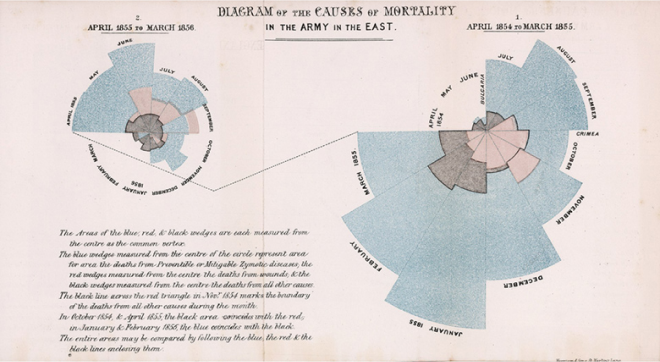
One of the best-known graphs in the history of data visualisation is the “rose diagram” that the nurse and statistician Florence Nightingale designed for her study of the mortality of British troops in the Crimean War in 1856. What fewer people know, however, is that she was not the creator of this chart.
Nightingale used this chart to show that most troop deaths were not due to war injuries, but to preventable causes such as poor camp hygiene and infectious diseases. Her success was such that the nurse was able to persuade the British government of the need for better sanitation systems.
The polar area chart has all its sections at the same angle, which clearly distinguishes it from the pie chart. This graph is often used to show the frequency of cyclical events. As seen in the case of Florence Nightingale, the circumference is divided into 12 sections representing the months of the year. Quantitative data (soldier deaths) are represented on the polar axis, with the size of the radius (not its area) reflecting the number of fatalities. Colour symbolises the types of cause of death: preventable deaths in blue, war wounds in red and fatalities in black.
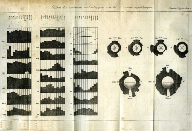
Despite the success of her work, the origin of the polar area chart does not lie with the famous nurse, but with André Michel Guerry, a French lawyer and amateur statistician who published several works on criminology. In 1829 he created the first polar area chart to show variations in weather and other phenomena over calendar cycles.
Although it is Florence Nightingale who has more than deservedly gone down in history for her contributions in both the medical and statistical fields, it is also fair to recognise the Frenchman Guerry for his contribution to data visualisation.