Is an infographic the same as data visualisation? As with most questions, there is no definitive answer and it depends on the expert you ask. From our point of view, both exercises are part of the same family, being infographics a simpler element than visualisation. Let’s see how they differ.
Alberto Cairo, in his book El arte funcional, points out that infographics and visualisation belong to the same continent in which each one occupies opposite ends of a line (presentation and exploration). For her part, Isabel Meirelles in her book La información en el diseño indicates that while infographics are visualisations that communicate information. The purpose of data visualisation is not only to transmit information, but also to reveal unknown patterns and relationships.
Therefore, we can say that infographics are the little brother of data visualisation, a subset of visualisation. Infographics show information in a visual form, whereas data visualisation allows second and third readings of the information shown. In other words, it answers different questions. Visualisation gives the observer the option to obtain more information and to relate it, it is a more complex and richer element. It is like those texts that allow reading between the lines; each reader stays at the level they want.
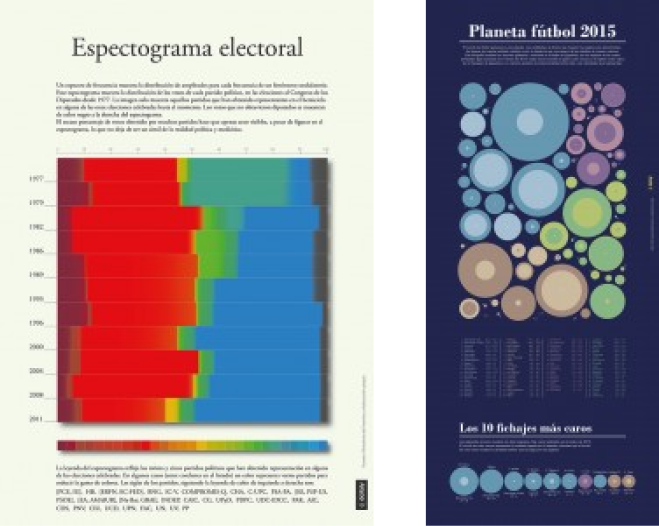
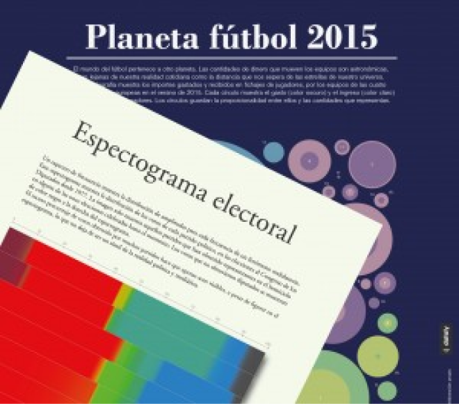
Let’s see the difference with two examples of some of the works we have published in our blog: Espectograma electoral and Planeta fútbol 2015.
In the first case, the infographic shows the evolution of the vote in the different Spanish general elections since 1977. The image hardly offers any information other than this.
The second example is a clear example of data visualisation. While the main information it offers is the expenses and revenues of each football team during the transfer market in the summer of 2015, a closer look shows richer information. For instance, it shows the difference between the four main European leagues, as the space occupied by each league signifies the volume of money moved in the market. It also shows whether clubs are running a surplus or deficit in the transfer market (if the dark circle is larger, there is a deficit) and by extension which league is more or less likely to run up debts in the transfer market. Another reading is the inequality within each league. In some leagues, such as Spain, the bulk of the money is handled by four or five teams, while the rest handle much smaller amounts.